Airline On-Time Performance
Longitudinal Trends, Carrier Delays, and Geographic Patterns in the US Airline Industry

Key Findings
- Stagnation in On-Time Performance: Despite a slight decrease in delay volatility, the analysis reveals that arrival delays have only decreased by 1% over 34 years, while departure delays have increased by 5%. This highlights a persistent challenge in improving overall on-time performance.
- Limitations in Delay Optimization: Arrival delays can be minimized by up to 45 minutes relative to departure delays, but can also exceed them by up to 250 minutes. This highlights significant variability in delay patterns and emphasizes the need for targeted strategies to manage both types of delays effectively.
- Top Delayed Carriers: JetBlue Airways, ExpressJet Airlines, and Frontier Airlines consistently rank among the top carriers with the highest frequency of delays, both at departure and arrival.
- Airports with Highest Delay Counts: The top three airports with the highest total delay counts are Chicago O’Hare International Airport, Hartsfield-Jackson Atlanta International Airport, and Dallas/Fort Worth International Airport.
Dataset
The Airline Reporting Carrier On-Time Performance Dataset, provided by the U.S. Department of Transportation’s Bureau of Transportation Statistics, contains scheduled and actual departure and arrival times reported by U.S. air carriers between 1987 and 2020. For this project, I used a 2 million-flight sample from the dataset, which represents less than 1% of the full dataset available through IBM Developer1.
1 The dataset is available in three sizes: the original dataset of 194,385,636 flights, a 2 million sample version and a 2 thousand sample of flights from LAX to JFK airport. All three versions are available as gzip compressed tar or csv files.
Key features include scheduled and actual flight times, dates, carrier information, origin and destination details, and cancellation or diversion statuses. The dataset also provides summary statistics such as elapsed time, distance, and delay causes. For a comprehensive list of variables, refer to the full here. Below is a summary of the main variable groupings:
Feature glossary
- Temporal variables:
Year,Quarter,Month,DayofMonth,DayOfWeek,FlightDate - Flight variables:
Reporting_Airline,Tail_Number,Flight_Number_Reporting_Airline - Origin/Destination variables:
OriginAirportID,Origin,OriginCityName,OriginState,OriginStateName,
DestAirportID,Dest,DestCityName,DestState,DestStateName
- Departure/Arrival time variables:
CRSDepTime,DepTime,DepDelay,DepDelayMinutes,DepDel15,DepartureDelayGroups
CRSArrTime,ArrTime,ArrDelay,ArrDelayMinutes,ArrDel15,ArrivalDelayGroups
- Taxi variables:
TaxiOut,WheelsOff,WheelsOn,TaxiIn - Cancellation variables:
Cancelled,CancellationCode,Diverted - Flight summary variables:
CRSElapsedTime,ActualElapsedTime,AirTime,Flights,Distance,DistanceGroup - Cause of Delay (Data starts 6/2003):
CarrierDelay,WeatherDelay,NASDelay,SecurityDelay,LateAircraftDelay
Preprocessing and Feature Engineering
The strategy for preprocessing interleaved univariate analysis with data cleaning and feature engineering for each variable grouping, using univariate insights to guide the preprocessing steps. This approach encompasses three key areas: conducting univariate analysis, preprocessing flight-related variables, and (re)engineering time-related features.
Univariate Analysis
I performed univariate analysis on each variable group to assess distributions, variability, and missing values. This involved:
df_overview: Provides a snapshot of the dataset, including its shape, sample head and tail, and non-null counts.
def df_overview(df):
    print(f"Shape: {df.shape}\n")
    print(f"Head and tail preview:")
    display(df)
    print(f"Df info:")
    print(df.info(verbose=True), "\n")
    print("-"*70)
univariate_preview: Generates a compact report with data types, unique values, top values, null value percentages, and summary statistics for selected columns.
def univariate_preview(df, cols, describe=True):
    display("Data Preview")
    display(df[cols].head())

    display("Value Counts")
    list = []
    for col in cols:
        list.append(
            [col,
            df[col].dtypes,
            df[col].nunique(),
            df[col].value_counts().iloc[:5].index.tolist(),
            "{:.2f}%".format(df[col].isna().mean()*100)]
            )
    display(pd.DataFrame(list,
                         columns = ['columns', 'dtypes', 'nunique', 'top5', 'na%']
                         ).sort_values('nunique', ascending=False))

    if describe:
        display("Summary Stats")
        display(pd.concat([
            df[cols].describe(),
            df[cols].skew().to_frame('skewness').T,
            df[cols].kurtosis().to_frame('kurtosis').T,
        ]))
I also visualized missing values using the missingno package2, and analyzed distributions and value counts with matplotlib and seaborn.
2 The missingno package offers tools for visualizing missing data patterns through heatmaps, bar charts, and dendrograms.
Preprocessing Flight Info Variables
The initial preprocessing phase focused on flight information variables, such as dates, flight numbers, and origin/destination details. Based on the insights from each univariate analysis, I performed the following preprocessing steps:
- Data Cleaning
- Converted
FlightDatetodatetime64[ns]: Enabled efficient date operations, aggregations, and visualizations. - Imputed Missing State and State Names: Addressed missing data to improve dataset completeness.
- Standardized City Names: Unified city names to ensure consistency and eliminate outliers.
- Removed Taxi, Cancelled, and Diverted Variables: Dropped these variables due to high missing data rates.
- Converted
- Feature Engineering
- Mapped Airline Codes: Used an airline dataset to convert codes to names for better readability and insight.
- Created Unique Flight Identifier: Combined carrier codes and flight numbers to reduce ambiguity and uniquely identify flights.
(Re)Engineering Time Variables
The second phase of preprocessing addressed a critical issue with time-related variables, especially concerning flight delays. The delay variables were calculated from the raw timestamps, without accounting for time zone discrepancies, daylight savings time, and cross-midnight flights. To address these, I developed a method to impute time zone information, correct timestamps, and accurately recompute delays. The steps are the following:
- Imputed Time Zone Information: Assigned time zones to timestamps using a dictionary of airport codes and time zones.
- Reverse Engineered Arrival Dates: Standardized times to UTC, recalculated timestamps based on flight departure dates and time differences, and converted back to local time zones.
- Removed Remaining Negative Delays: Filtered out negative delay values to maintain accurate delay calculations.
- Recalculated Delays: Adjusted delays based on scheduled versus actual times, accounting for time zone differences and daylight savings time.
Additional cleaning and engineering included:
- Standardized Time Representations: Converted 0s to NaN and 2400s to 0s for consistency.
- Imputed Missing CRS Values: Filled in missing scheduled times using differences between actual times and delays.
- Optimized Data Types: Improved computational efficiency by adjusting data types.
- Datetime Recalculations: Created UTC versions of time variables and recalculated delays and elapsed times more accurately than the original dataset.
Exploratory Data Analysis
The Exploratory Data Analysis (EDA) for this project employed two approaches: a systematic univariate analysis during preprocessing and a targeted bivariate and multivariate analysis to address each research question3. The investigation was organized around four main themes:
3 While the bivariate analysis adopts a longitudinal perspective to compare delay frequencies over time, a cross-sectional approach could further enhance insights by examining delays at specific points in time. This advanced analysis is planned for future work.
- Longitudinal: Examining how delays vary over time.
- Correlational: Investigating the relationship between departure and arrival delays.
- Corporate: Analyzing delay patterns across different carriers.
- Geographical: Assessing how delays vary by airport.
Before answering these questions, I will first summarize the findings from the univariate analysis
Univariate Analysis
The univariate analysis revealed several key insights about the dataset:
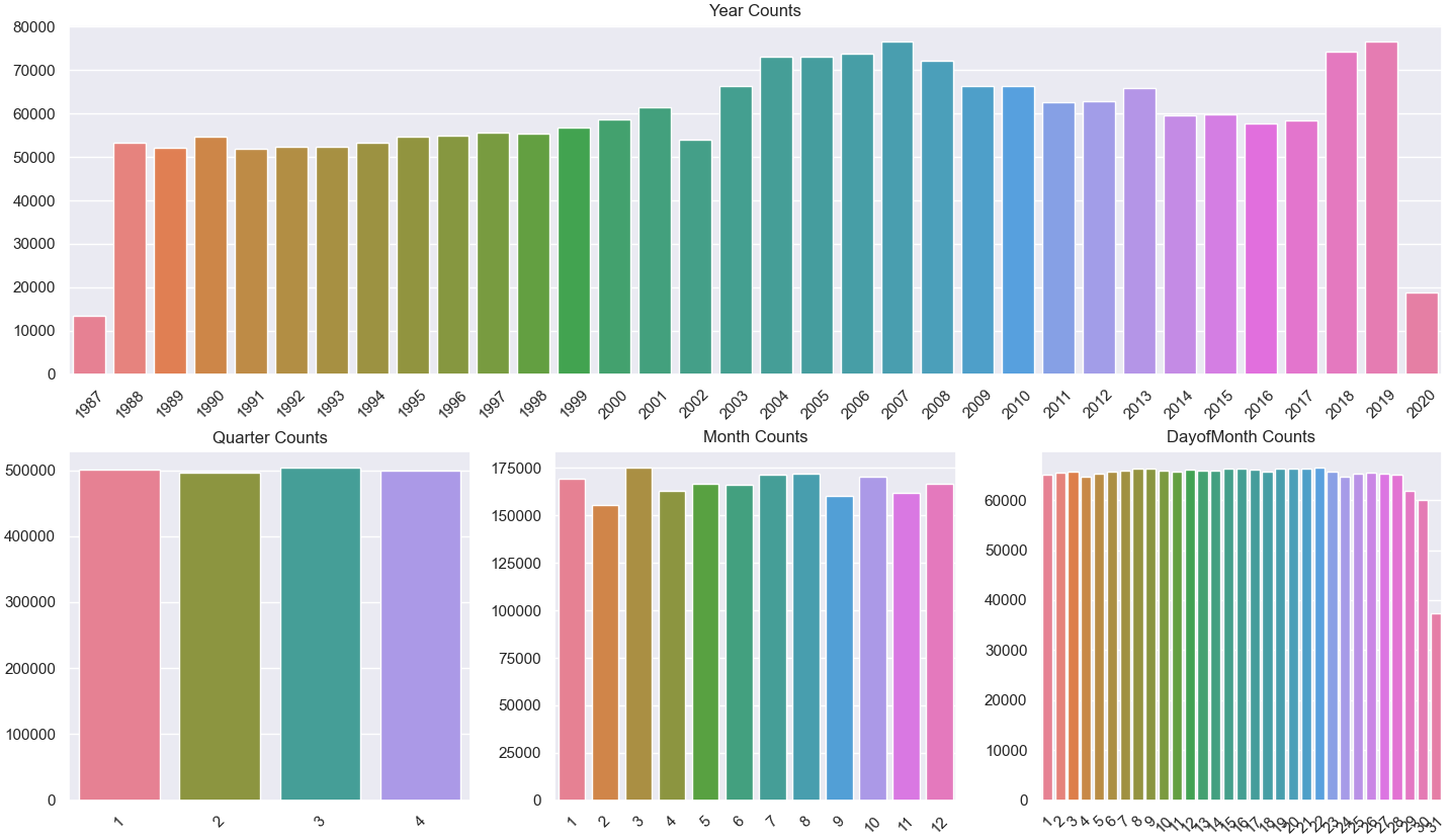
Date Columns: The flights span 34 years, with the distribution mean slightly shifted left (2005), suggesting industry growth specially in the past 15 years. Other temporal variables such as months, days, and weekdays are evenly distributed.
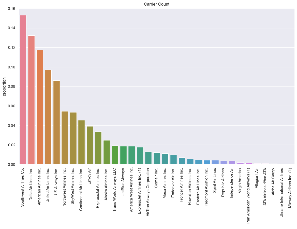
Flight Information: Among the 33 unique carriers, Southwest Airlines (WN), Delta Air Lines (DL), and American Airlines (AA) are the most frequently represented.
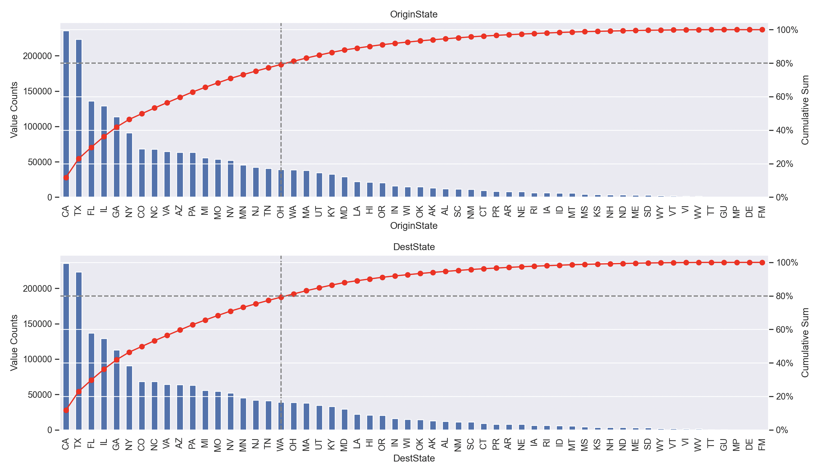
Origin/Destination: Flights are distributed across all 50 U.S. states and five overseas territories, including Puerto Rico, the U.S. Virgin Islands, and Guam. The top destinations include California (CA), Texas (TX), Florida (FL), Illinois (IL), Georgia (GA), and New York (NY).
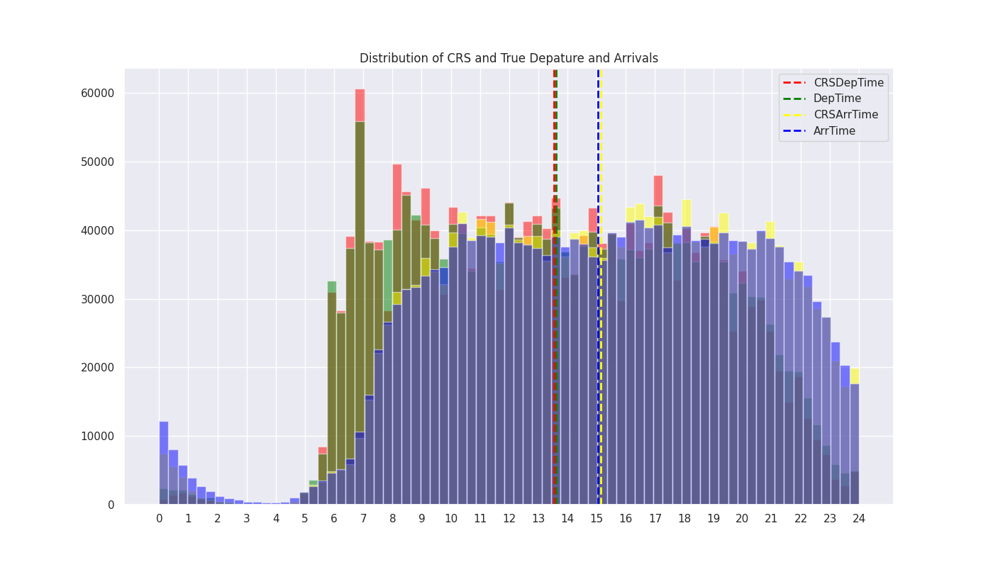
Time Variables: Departures peak in the morning, while arrivals are most frequent in the evening. The mean CRS (Scheduled) and actual times for departures and arrivals, respectively, are nearly identical, indicating that average flight delays are small
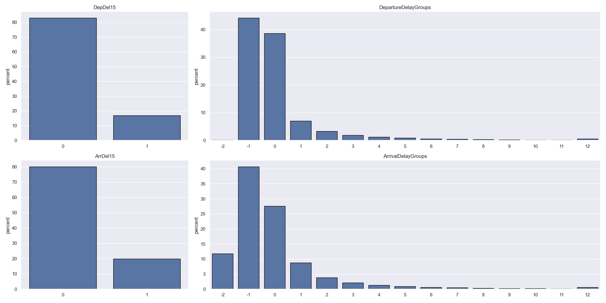
Delay Variables: About 80% of flights are on time, with 20% experiencing delays exceeding 15 minutes. Delays are right-skewed, with over 40% of flights arriving early by less than 15 minutes and about 30% arriving exactly on time. Delayed flights typically fall within the 15 to 40-minute range.
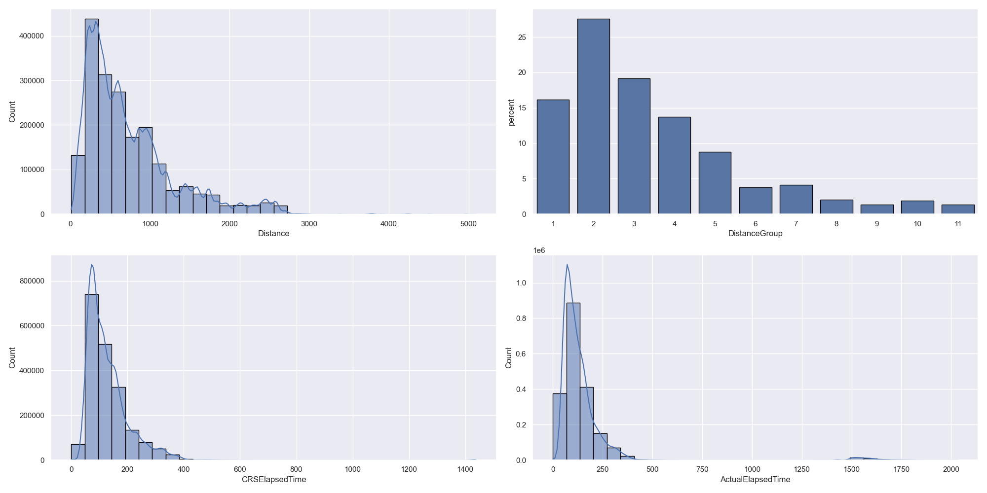
Flight Summary: Most flights cover distances under 1000 miles and have durations of less than 160 minutes (2 hours and 40 minutes), as indicated by the right-skewed distribution of elapsed time variables.
Bivariate Analysis
How do delays vary across time?
This question involves a longitudinal analysis comparing the number of departure and arrival delays across time.
To answer this question, I aggregated the data by month and year, which provides a balance between granularity, interpretability and computational efficiency. Rather than using raw delay sums, I normalized the counts by the total number of flights each month to provide a more accurate depiction of delay frequency, accounting for variations in monthly flight volumes.
I then visualized the monthly evolution of delays over the years, as illustrated in the figure below.
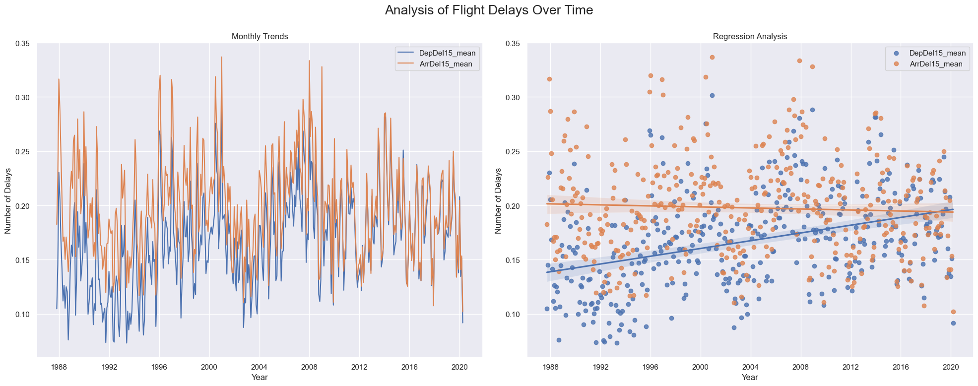
The normalized plots above reveal several insights:
- Cross-sectional observations:
- The line plot shows periodic fluctuations in both departure and arrival delays, reflecting seasonal throughout each year.
- A sharp drop in delays between 2001 and 2003 suggests possible external influences, such as the reduction in flights post-9/11 impacting delays4.
- Longitudinal observations:
- The regression plot indicates a narrowing gap between departure and arrival delays over time, converging to approximately 20% by 2020.
- The line plot shows a reduction in the volatility of delays over the years, suggesting a slight stabilization in the frequency of delays.
4 One potential cause for this temporary drop in delays is the contraction in the airline industry that followed 9/11, reducing the amount of delays together with the number of flights (see this article)
Although the narrowing gap and reduced volatility might suggest improved on-time performance, the apparent improvement is due to a 5% increase in departure delays rather than a reduction in arrival delays, with arrival delays decreasing by only 1% over 30 years. This confirms that airlines have been unable to improve on-time performance at arrivals and have become less efficient in managing departure delays.
Are departures delays correlated with arrival delays?
This question involves a correlation analysis to explore the relationship between departure delays and arrival delays, both of which are continuous variables.
I calculated the Pearson correlation coefficient for flights delayed by more than 15 minutes5, excluding on-time flights to avoid skewing the results. The Pearson coefficient ranges from -1 (perfect negative correlation) to 1 (perfect positive correlation), with 0 indicating no linear relationship. I used a custom jointplot function to visualize the correlation, which combines a scatter plot with a box plot to display the distribution of both variables and the Pearson coefficient.
5 15 minutes is the industry standard for defining a delayed flight.
Prior to plotting, I cleaned the data by removing extreme cases, such as negative delays caused by flight times crossing the midnight transition to daylight savings time, which were not corrected in the preprocessing. The resulting jointplot is shown below.
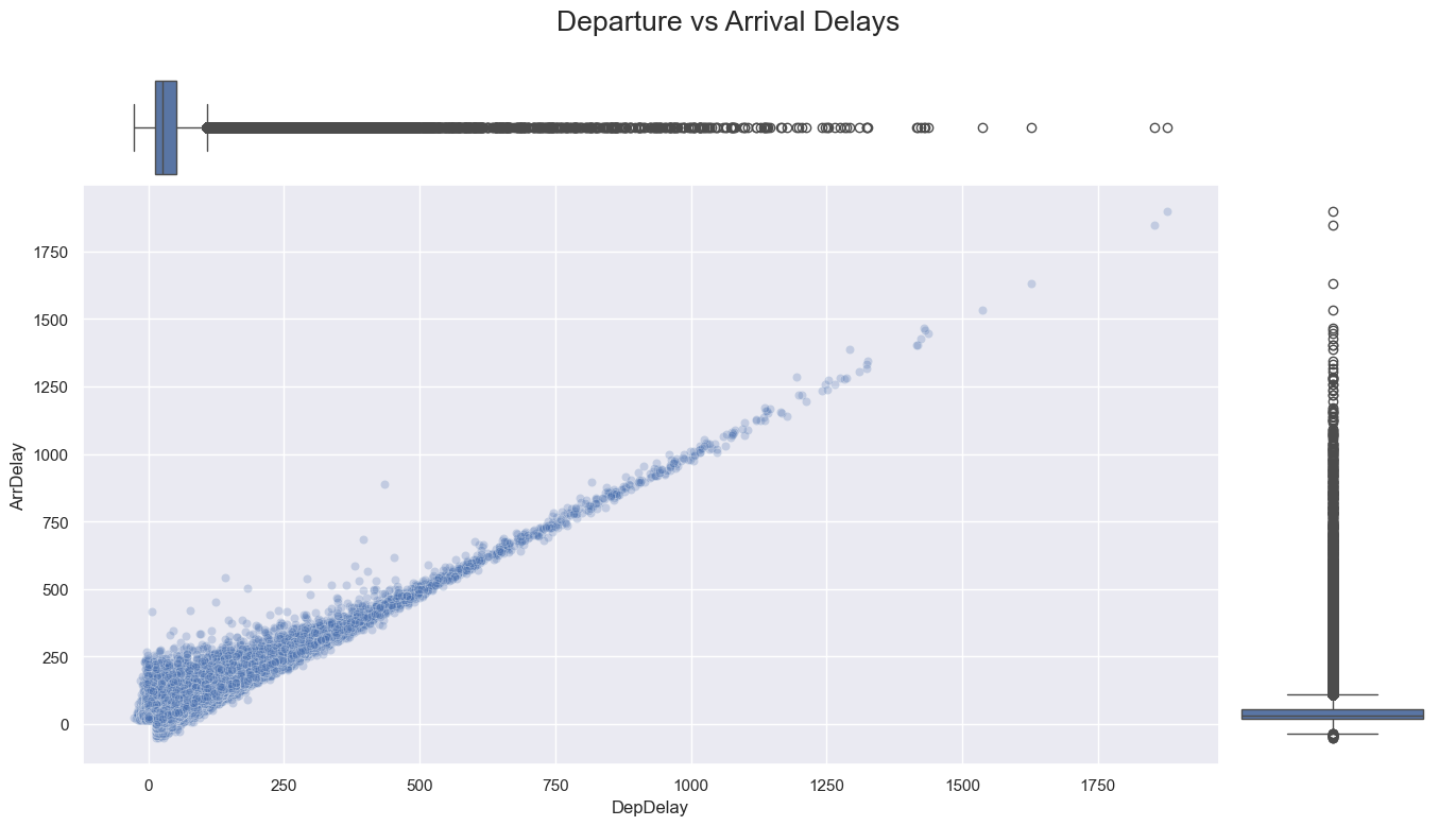
The Pearson correlation coefficient between departure and arrival delays is 0.93, indicating a strong positive linear relationship. Key observations from the jointplot include:
- Outliers and Extreme Cases: The scatter plot reveals a wide range of outliers beyond the interquartile range, but these outliers generally follow the strong linear relationship between departure and arrival delays.
- Linear Relationship: While the relationship is linear across the full range of data, it becomes more dispersed at lower delay values and more tightly correlated at higher values.
- Interquartile Range: The interquartile range for both kinds of delays is narrower compared to the full data range, with most delays concentrated within 60 minutes.
To gain a clearer understanding of the core relationship, I recalculated the Pearson correlation coefficient focusing on the interquartile range. This refined analysis is shown in the updated jointplot.
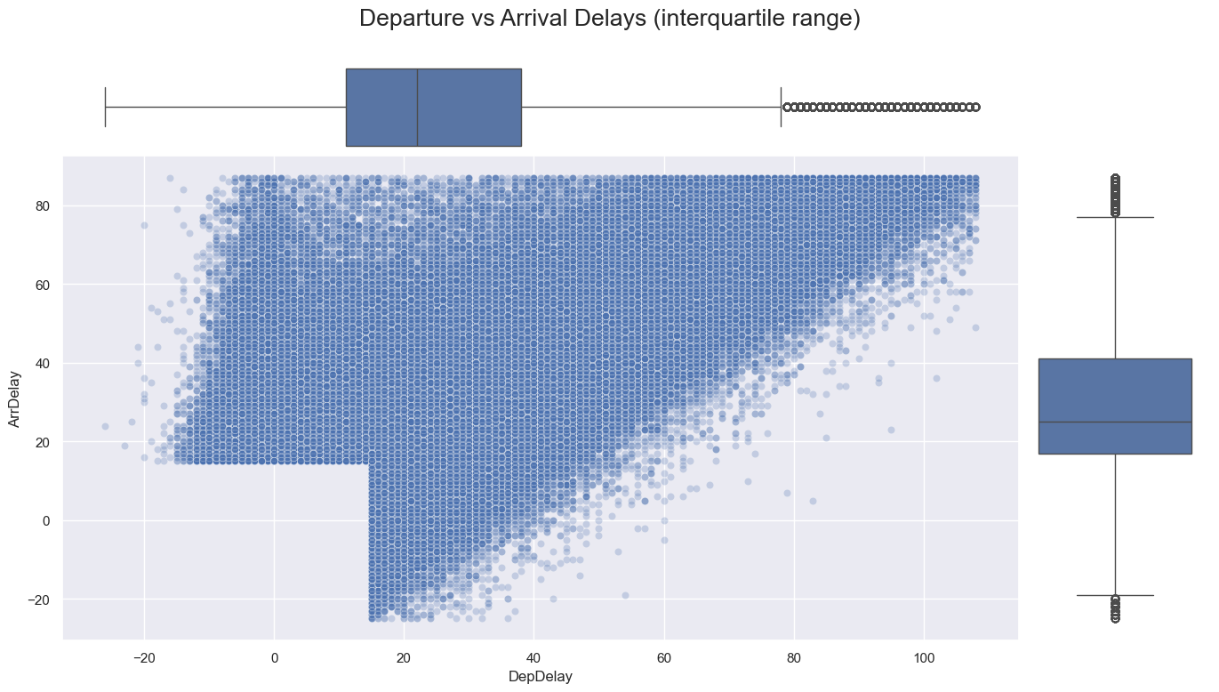
Within the interquartile range, the Pearson correlation coefficient is 0.67, reflecting a weaker yet still positive linear relationship. The jointplot reveals a broader dispersion of data points within this range, with the majority of delays falling between 15 and 40 minutes, as shown by the adjacent box plots. The plot’s empty square in the lower left represents flights that did not meet the industry delay threshold.
The filtered scatter plot has two distinct boundaries that define the relationship between departure and arrival delays. I calculated approximate regression lines for these boundaries to understand the relationship more clearly.
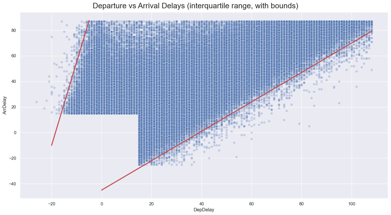
Two kinds of observations can be made about the correlation of departure and arrival delays for the interquartile range:
- Shallow Bound: Indicates the minimum threshold to which arrival delays can be minimized.
- Follows a linear relationship: \(y = 1.15x - 45\), where \(y\) is the arrival delay and \(x\) is the departure delay.
- Implies that the arrival delay can only be reduced by up to 45 minutes relative to a departure delay.
- Steep Bound: Indicates how much arrival delays can increase relative to departure delays.
- Follows a much steeper linear trend: \(y = 6.5x + 120\), where \(y\) is the arrival delay and \(x\) is the departure delay.
- Indicates that arrival delays can significantly exceed the general trend, suggesting the influence of external factors such as diversions, weather, or congestion at the arrival airport.
- Reflects that arrival delays can significantly exceed departure delays due to
- Shows an upper limit of 250 minutes for on-time departures (see first scatterplot), then progressively aligning with the general trend as departure delays increase.
In summary, the historical correlation analysis within the interquartile range shows a moderately positive linear relationship between departure and arrival delays. The broad dispersion of data points reflects the impact of external factors that influence arrival delays more significantly than departure delays. Historically, this dispersion has been constrained by two limits: arrival delays have typically been minimized by up to 45 minutes relative to departure delays (lower bound) but can exceed them by up to 250 minutes (upper bound). Conversely, analysis of the full range of data has historically demonstrated a strong positive linear relationship between departure and arrival delays.
How do delays vary across carriers?
Analyzing how delays vary across carriers is one of the most frequently asked questions to measure individual airline performance and market competitiveness. It requires a bivariate analysis comparing the frequency of delays across carriers.
Traditional approaches often focus on total delay counts, but this can be misleading due to:
- Flight Volume: Carriers with more flights naturally accumulate higher delay counts, which can skew the results.
- Carrier Age: Older carriers tend to have more historical data, potentially influencing delay counts.
To address these issues, this analysis employs a more precise metric: normalized delay frequency. This metric adjusts delay counts by the total number of flights per carrier6. This method provides a clearer picture of delay frequency by accounting for variations in flight volume and partially considering carrier age. The plots below illustrate the normalized delay frequencies across carriers.
6 An alternative normalization approach could involve adjusting by carrier age, but such data was not available for this analysis.
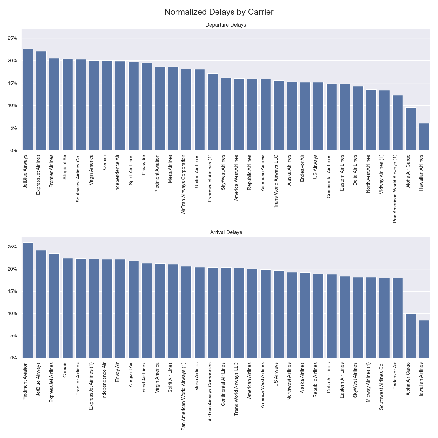
The normalized delay counts offer a robust comparison of on-time performance across airlines, even for those with varying flight volumes or ages. Key insights from the analysis include:
- Consistent Rankings: JetBlue Airways, ExpressJet Airlines, and Frontier Airlines consistently rank among the top carriers for both departure and arrival delays.
- Top Departure Delays: JetBlue Airways, ExpressJet Airlines, Frontier Airlines, Allegiant Air, and Southwest Airlines have the highest proportion of delays at departure.
- Top Arrival Delays: Piedmont Airlines, JetBlue Airways, ExpressJet Airlines, Conair, and Frontier Airlines have the highest proportion of delays at arrival.
- Lowest Delays: Carriers with the lowest delay frequencies include historical carriers with shorter operational histories in the dataset, such as Pan American World Airways, Midway Airlines, and Northwest Airlines, as well as regional carriers like Hawaiian Airlines, Aloha Air Cargo, Endeavor Air, and SkyWest Airlines.
- Largest Differences: Southwest Airlines shows the largest disparity between departure and arrival delays, ranking 5th in departure delays but 20th in arrival delays.
For evaluating carrier performance, the proportion of departure delays is particularly relevant. Departure delays are more directly controllable by carriers, influenced by factors such as boarding, fueling, and maintenance. Furthermore, as shown by the correlation analysis, departure delays are positively correlated with arrival delays, making them a key indicator of performance. Arrival delays, influenced by external factors like weather, air traffic control, and airport congestion, are less indicative of a carrier’s operational efficiency.
Considering this, carriers with the highest proportion of departure delays, also consistent in arrival delays, are JetBlue Airways, ExpressJet Airlines, and Frontier Airlines.
How do delays vary by airport?
Comparing delay frequencies across airports helps evaluate airport performance and its impact on the aviation sector. This analysis uses two metrics: total delays and normalized delay frequency. However, choosing a metric to answer this question proves challenging, as each metric reveals a completely different story:
- Total delays are skewed towards airport size: Larger airports with more flights tend to show higher total delays, reflecting their size but potentially skewing results.
- Advantage: Differentiates performance between airports.
- Disadvantage: Biased towards larger airports.
- Normalized delays show high kurtosis: This metric adjusts for airport size, but shows a distribution tightly clustered around the mean, which makes it harder to distinguish between airports.
- Advantage: Provides a clearer view of delay frequency across airports.
- Disadvantage: Less effective in differentiating among airports with similar delay frequencies.
Given these factors, I chose to use total delay counts for arrival delays, as it provides a clearer picture of major airports’ performance and is more relevant for assessing well-known airports. Arrival delays, influenced by external factors like airport operations, offer a better metric for evaluating airport performance compared to departure delays, which are more affected by carrier operations7. Below are the plots of total arrival delays across airports.8. Below are the plots of the total delay counts across airports.
7 According to the Airline On-Time Statistics and Delay Causes, air carrier delays accounted for nearly 25% of national delays from January 2010 to March 2020
8 Of course, as stated in the previous section, airport management is not the only cause for arrival delays. There is also a moderate correlation between departure and arrival delays which increases after as certain threshold of departure delays. However, when comparing airports, arrival delays abstract the role of the carrier and focus on the external factors, among which is airport management.
Arrival Delays by Airport
The bubble map visualizes arrival delays by airport, with bubble size representing the total number of delays. Key insights include:
- Top Airports: The top five airports with the highest total delay counts are Chicago O’Hare International Airport (ORD), Hartsfield-Jackson Atlanta International Airport (ATL), Dallas/Fort Worth International Airport (DFW), Los Angeles International Airport (LAX), and San Francisco International Airport (SFO).
- Costal Airports: Coastal airports such as Los Angeles (LAX), San Francisco (SFO), Newark (EWR), and Boston (BOS) also rank high among the top 15 airports.
- New York Area Congestion: Newark (EWR) and LaGuardia (LGA) are among the top ten for delays, highlighting congestion and operational challenges in the New York area.
- Geographical Spread: The top 20 airports for delays are spread across the country, showing that delays are a widespread issue.
- JFK: John F. Kennedy (JFK) ranks 20th with 6,095 delays, significantly lower than other major airports in the New York Metropolitan area. The causes of this difference would be an interesting question for further analysis.
Overall, this analysis highlights that larger airports, particularly those in coastal and high-traffic areas like New York, experience significant delays. The geographical spread of delays underscores that this issue affects airports nationwide. Overall, this analysis underscores the importance of addressing delays at both major hubs and regional airports to improve the efficiency of the U.S. aviation system.
Conclusion
This project analyzed 30 years of US domestic flight data to uncover trends in on-time performance across carriers, airports, and time. The analysis focused on four key questions: how delays vary over time, the correlation between departure and arrival delays, variations in delays among carriers, and delay distribution across airports. The findings are summarized below:
- Longitudinal Analysis
- Over 34 years, the gap between departure and arrival delays has narrowed due to an increase in departure delays, not a decrease in arrival delays.
- Delay volatility has slightly decreased, suggesting more stable seasonal delay patterns.
- Arrival delays have only decreased by 1%, while departure delays have increased by over 5%, indicating limited progress in improving on-time performance.
- Correlation Analysis
- Departure and arrival delays show a strong positive linear relationship, with a Pearson correlation coefficient of 0.93.
- Within the interquartile range, the correlation weakens to 0.67, and delays are bounded by two linear trends: arrival delays can be minimized by up to 45 minutes relative to departure delays but can exceed them by up to 250 minutes.
- This disparity reflects that while departure delays are more under the carrier’s control, arrival delays are influenced by external factors like weather and airport congestion.
- Carrier Analysis
- JetBlue Airways, ExpressJet Airlines, and Frontier Airlines consistently have the highest frequencies of delays at both departure and arrival.
- Southwest Airlines shows the largest difference between departure and arrival delays, ranking 5th in departure delays but 20th in arrival delays.
- Departure delays are a more accurate indicator of carrier performance, as they are influenced by operational factors such as boarding and maintenance.
- Airport Analysis
- The top airports with the highest total delay counts are Chicago O’Hare, Hartsfield-Jackson Atlanta, Dallas/Fort Worth, Los Angeles, and San Francisco.
- Coastal airports like Los Angeles, San Francisco, Newark, and Boston rank high, indicating congestion and operational challenges in both coasts.
- The geographical spread of the top 20 airports shows that delays are a nationwide issue, spread across the Northeast, Southeast, Midwest, Central, and West regions of the US.
The analysis underscores persistent challenges in improving on-time performance, particularly with departure delays. The strong correlation between departure and arrival delays emphasizes the importance of addressing issues at the departure stage to enhance overall punctuality. The results suggest that tailored strategies are needed for different carriers and airports. The findings from this project have been effectively translated into an interactive visualization dashboard, providing valuable insights for stakeholders to inform decision-making and improve operational efficiency in the aviation industry.